Laid Back Luxe
RESIDENTIAL PROJECT
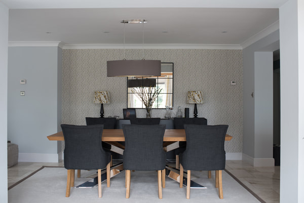
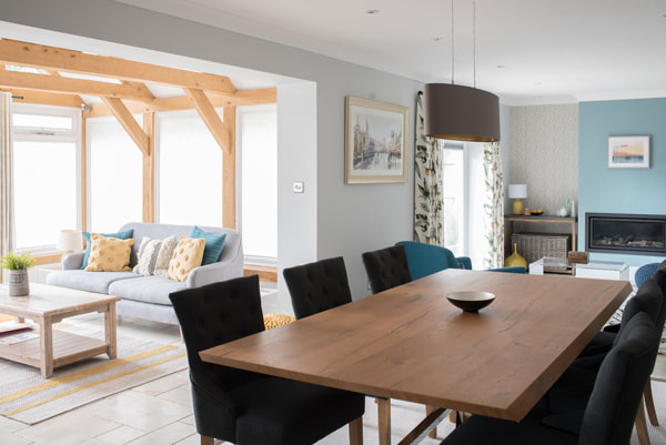
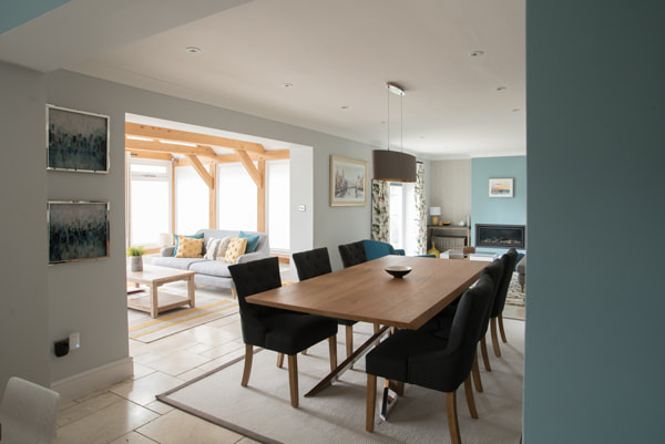
This project required a small amount of building work - blocking off a redundant door from the hallway and opening up the kitchen / dining room into a small living area to make one large sociable space that the family would spend the majority of their time in.
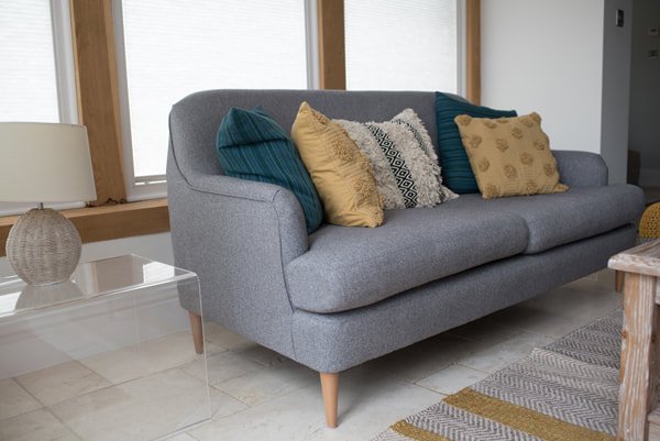
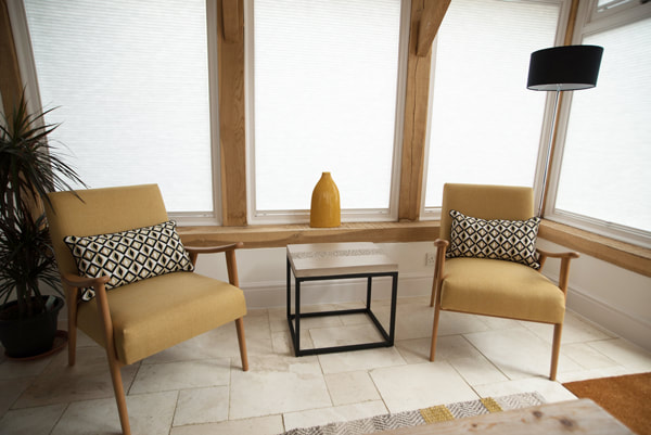
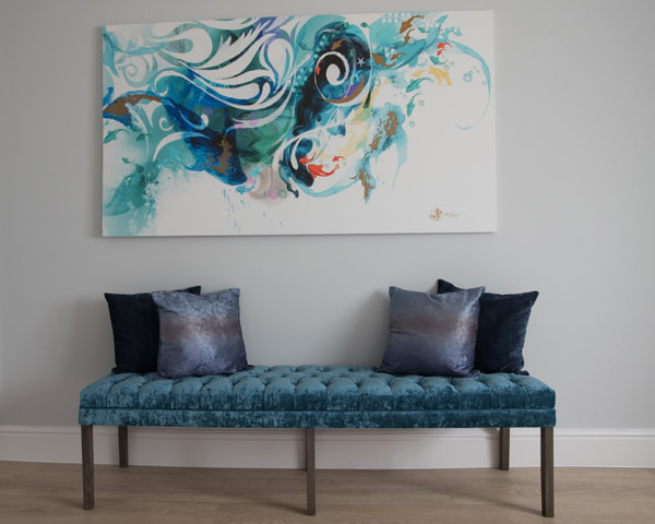
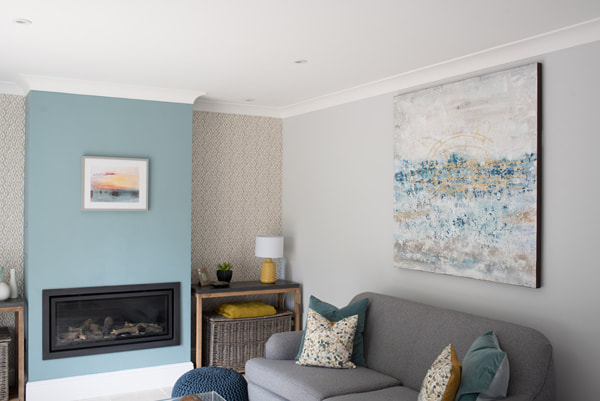
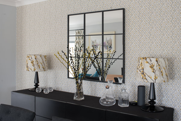
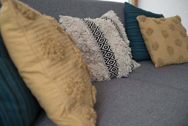
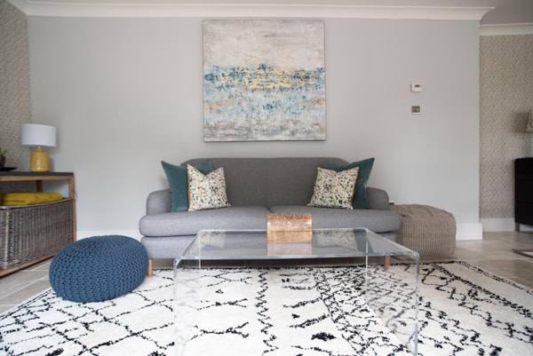
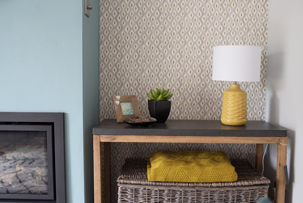
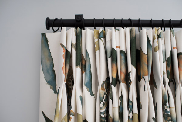
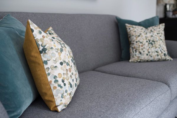
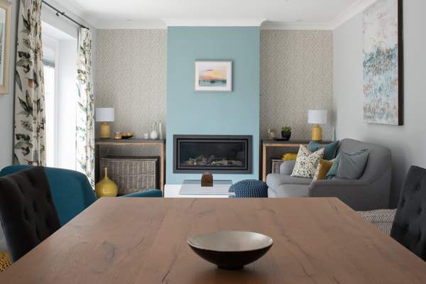
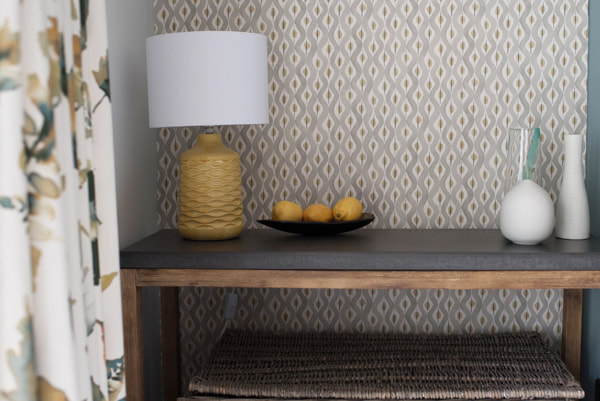
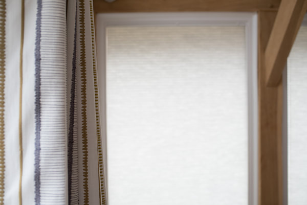
With an open plan space it’s important to create a cohesive look - but also zone and define the use of each area. The client wanted something that felt fresh and had colour without being overwhelming or too energised - as they wanted to relax and chill out in the rooms. Blue was a firm favourite for the client so I chose a pretty, aqua teal colour, which is a playful blue, as the main colour in the snug area. I used mustard yellow as the feature colour in the conservatory area to add warmth. I then added splashes of mustard to the snug area and teal to the conservatory to tie the two areas together. We used black throughout the space - as a constant accent to thread throughout the design - from the fire, wrought iron curtain poles, large sideboard in the dining room and side tables in the conservatory.
The client wanted a relaxed but grown up, luxurious feel so I chose materials such as velvet, glass and chrome to speak to the more polished vibe and then tempered this with cushions and rugs (including a gorgeous Berber design) with a more Scandi feel to stop the space feeling too formal.
The kitchen remained the same but had a refresh with a coat of paint in a beautiful teal blue which was repeated on the chimney breast in the snug. Echoing colours and accents throughout each space lets them have their own identity but hang together beautifully.